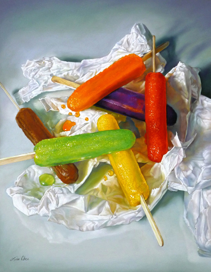
 The Color of Summer 23 X 18 Pastel on board  After spending much of my career painting people and pets with mostly neutral colors such a browns, tans, red-oranges, and everything else that represents skin tones and fur, I welcomed a change of palette colors for The Color of Summer. Painting a still life of colorful melting popsicles is not only tempting but also challenging! It's a race against the appetite and the clock. I think this painting captures that perfect moment from summertime when the popsicles have reached that "just about to drip of the stick" stage, when they are the juiciest and most delicious. I assure you that is true because I ate the entire still life arrangement!
All that work in color was rewarded with a lovely article in Pastel Journal's "Food for Thought" feature in their February 2013 issue along with another colorful image titled Sweet Escape.
0 Comments
|
Categories
All
Lisa OberWelcome! I'm so glad you are here and I hope you find some of the information I have shared helpful. 
Interested in taking a workshop? Click here for a listing of where I am heading and join me for the fun!
|