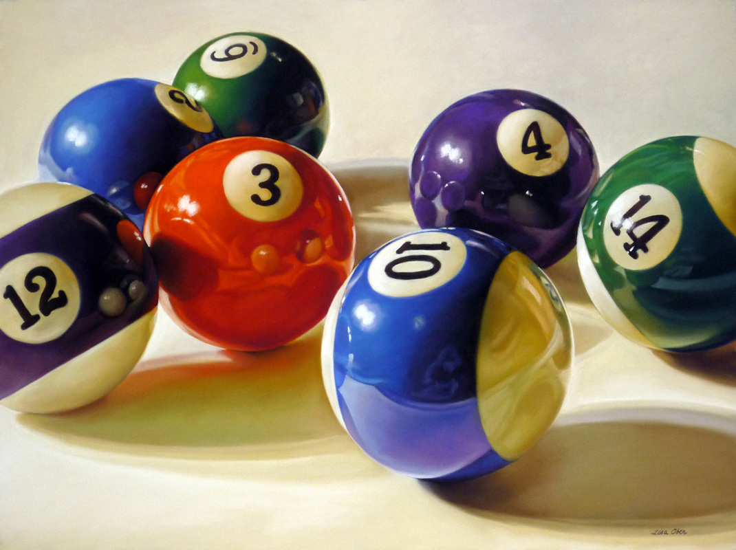
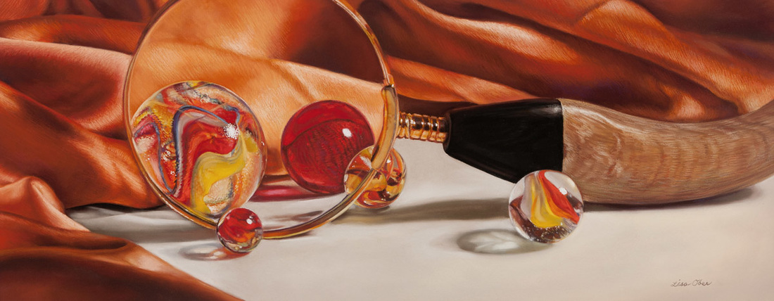
 Upon Closer Inspection 10" x 18" Pastel on Board SOLD  Having a Ball This Year
24" x 18" Pastel on Paper 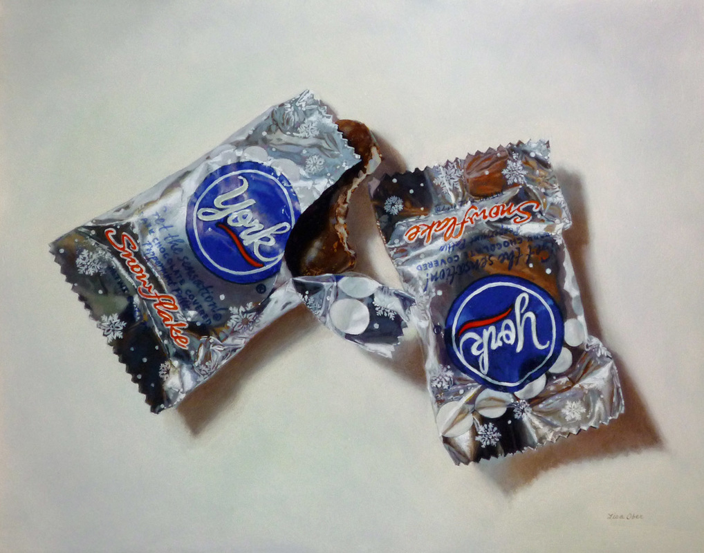 Celebrate the season with chocolate! That's what I often say. And why not when the chocolate comes in delicate shiny little foil wrappers? I think it is important to test the chocolate to make sure it is tasty. Sure, this still life painting could have worked as two pristinely wrapped mint chocolates, but I wanted to make sure that what was inside was as good as I assumed-and I was in the mood for celebrating. In case you're wondering, it was excellent chocolate. New York, Old York
11" x 14" Oil on Panel 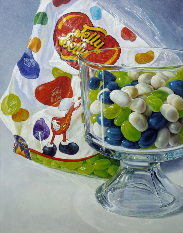 The Musical Fruit
28" x 22" Oil on Gallery Wrapped Canvas 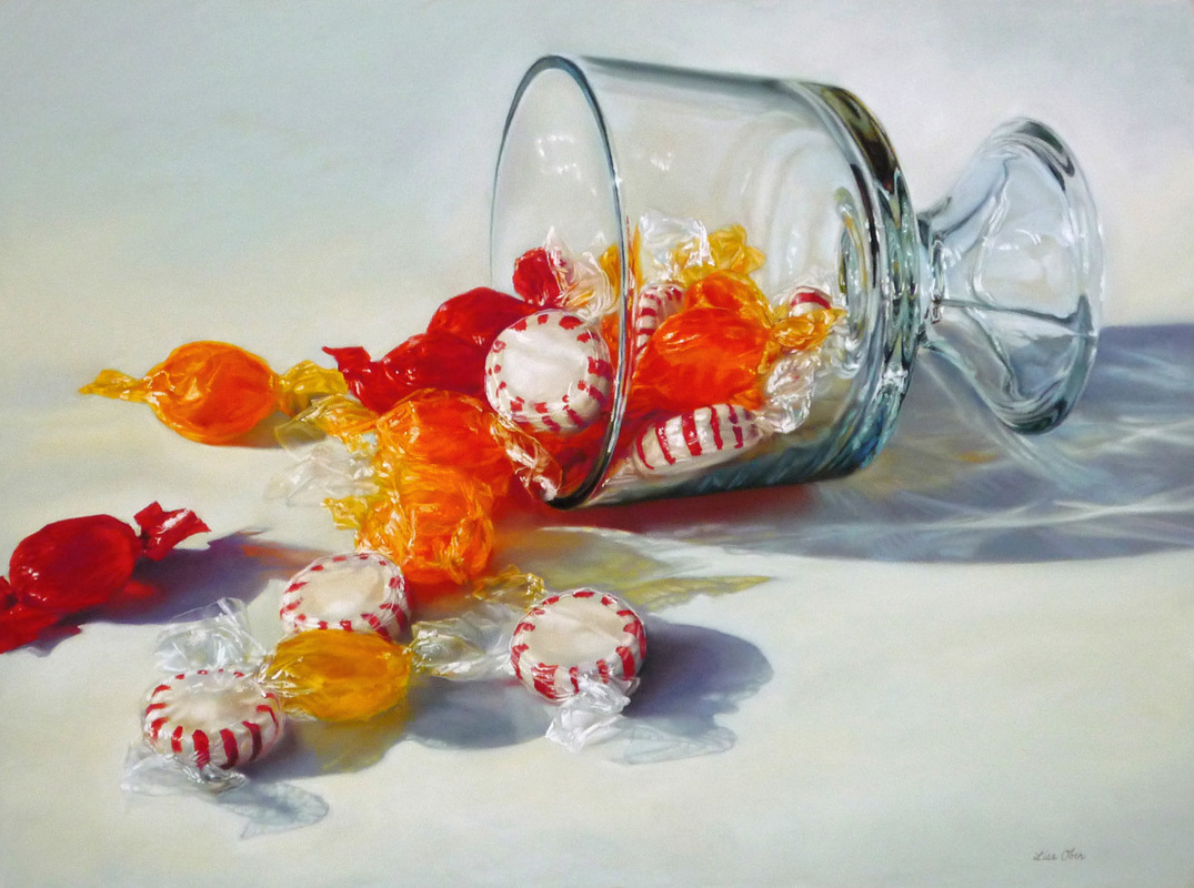 Sweet Escape 18 X 24 Pastel on board
I didn't count how many pieces of candy were in the dish before I got to them but I'm pretty sure there were at least 5 more pieces when I started. I've been known to eat my still life arrangements and this one was no exception.
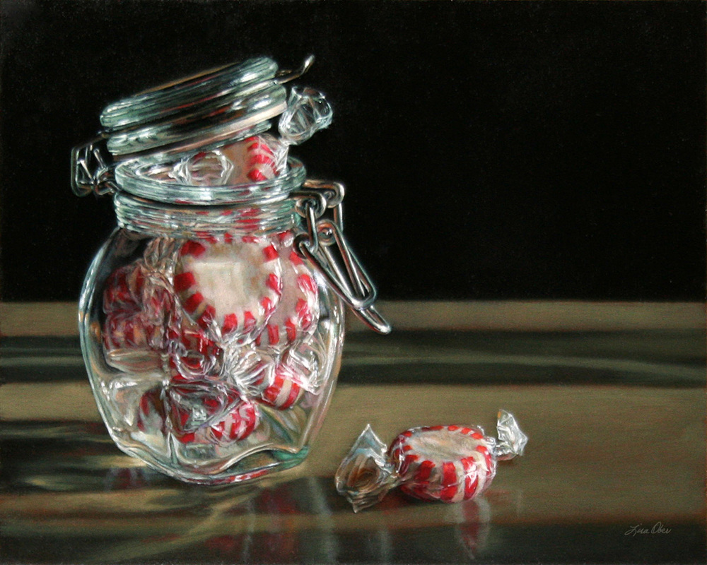
There is nothing more fun to paint than the challenges posed by glass, metal, or cellophane. With pastel painting, it's particularly difficult to get small details like those you see on the candy wrappers above. Patience and a steady hand are helpful but there is something to be said for having a butterscotch or peppermint candy to keep you going until you get it right. 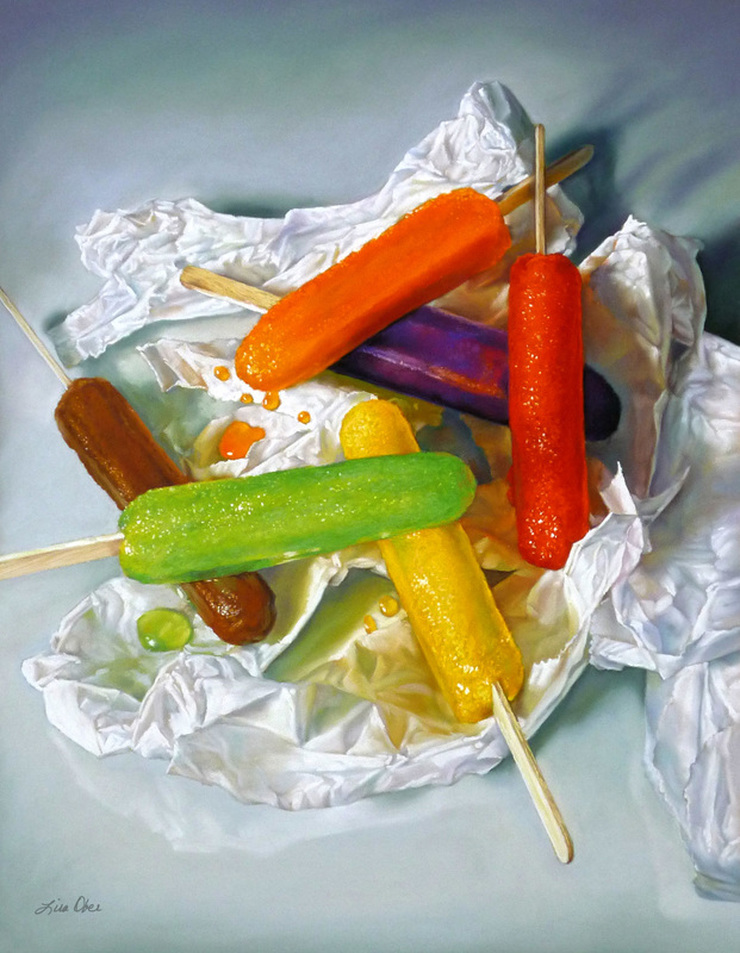 The Color of Summer 23 X 18 Pastel on board  After spending much of my career painting people and pets with mostly neutral colors such a browns, tans, red-oranges, and everything else that represents skin tones and fur, I welcomed a change of palette colors for The Color of Summer. Painting a still life of colorful melting popsicles is not only tempting but also challenging! It's a race against the appetite and the clock. I think this painting captures that perfect moment from summertime when the popsicles have reached that "just about to drip of the stick" stage, when they are the juiciest and most delicious. I assure you that is true because I ate the entire still life arrangement!
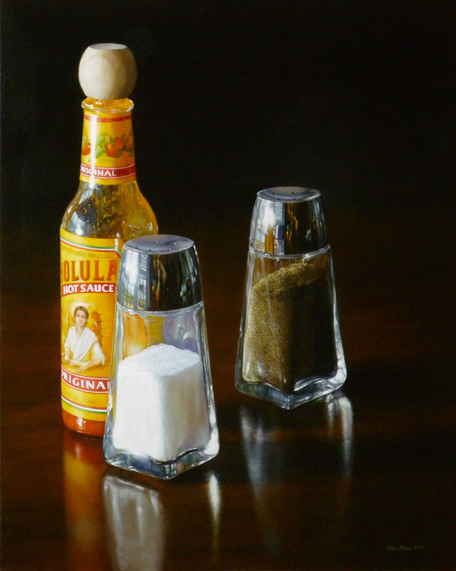
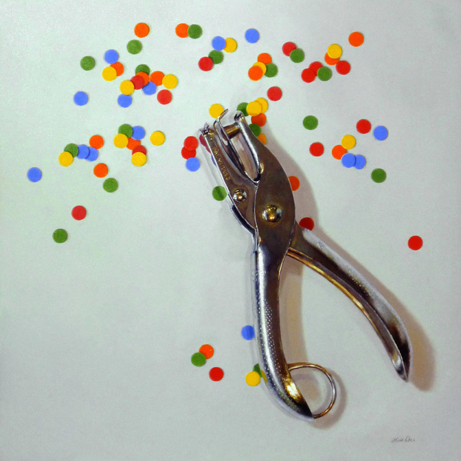
All that work in color was rewarded with a lovely article in Pastel Journal's "Food for Thought" feature in their February 2013 issue along with another colorful image titled Sweet Escape. 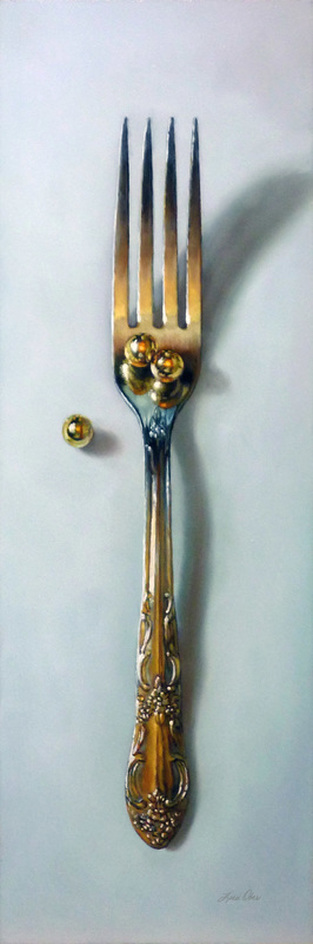 The Art of Fine Dining 18 X 6 Oil on panel Sold As a foodie, I do think there is an art to fine dining. I appreciate creative plating, the arrangement of colorful edibles, and of course the taste! Fine dining doesn't have to mean expensive. It just means fabulous food! Often, the silverware, plates, or glasses capture my attention and beg to be painted. Their colorful reflections of the food nearby or the way the light falls on the details are simply too interesting to ignore. The placement of pea-sized gold pearls on the fork symbolizes the whole experience of enjoying good food and adds another design element to the sharp edges already in the image.
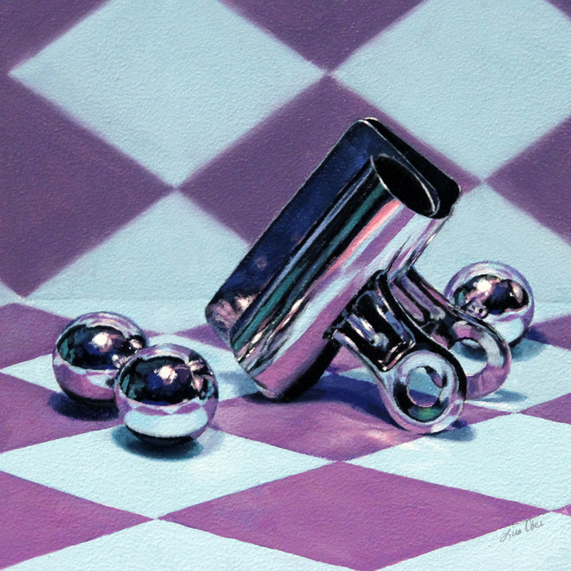
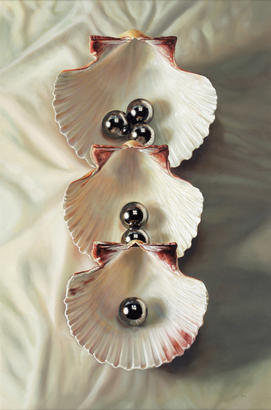 Shell Game 36 X 24 Oil on Panel Sold The shyster's game of shells is turned on its side in this painting titled Shell Game. Graduated sizes of shells are placed vertically, one on top of the other with each shell containing a different number of steel ball bearings. The harsh, steely color of the balls arranged inside the soft, iridescent pearl hues of the shells make this painting captivating on many levels.
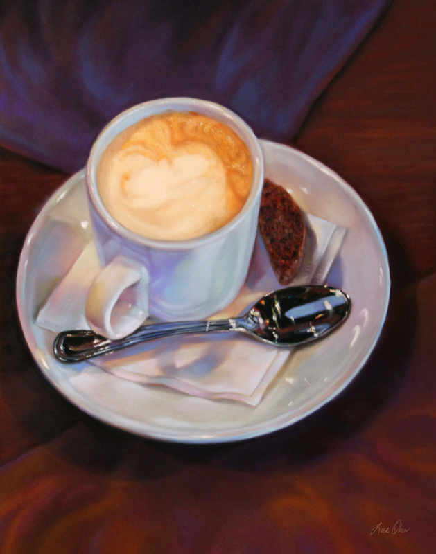
Unsuspecting people fall for the shell game over and over, and you will be drawn into this painting again and again seeing something different each time, but without the consequences. 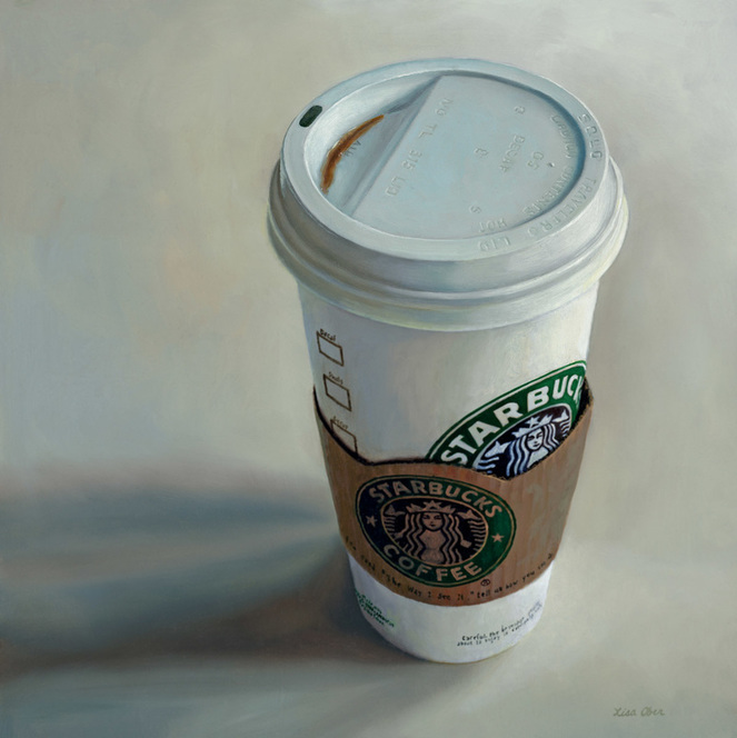 My Middle Name 12 X 12 Oil on Panel Sold I am a confessed coffee drinker! Oddly, I drink mostly decaffeinated coffee but I still have an obsession with it. It's been very convenient to have a Starbucks drive-thru about 45 seconds from my house and I've been there so many times that there is a drink named after me called the Lisa Special. When I pull up to the speaker all I (or anyone else for that matter) have to say is that I would like to order a Lisa Special and it is magically served to me at the window. Talk about an efficient way to get a cup of coffee!
I call this one My Middle Name because I have been to Starbucks so many times that it should indeed be my middle name. I believe I have personally put many a teenager through college with my addiction. I probably should have titled it THE LISA SPECIAL. Let me know if you'd like the specific ingredients and you can order one too. 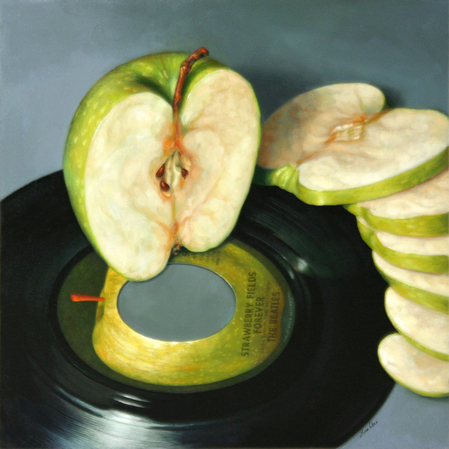 Yesterday 10 X 10 Oil on panel Sold I have an extensive collection of 45 records that I adore, songs that take me back in time to moments of my childhood and teenage years. A few of them are rare but overplayed and scratchy and I still love them. This Apple 45 is one of those and I thought it a great backdrop for a still life painting.
  Pastel of Pastels in Pastel 20 X 17 UART Sanded Pastel Paper Of over 2500 entries from all over the world, this piece received Second Place in the Still Life and Floral category of the 15th Annual Pastel 100 Competition. I was thrilled! This was the first time I had entered a serious competition as a professional artist. Though I had spent decades as a professional, I had never entered my artwork in a competition. There is no particular reason for not doing so; I simply focused my attention in other areas, mainly commissioned work. What a nice way to start!
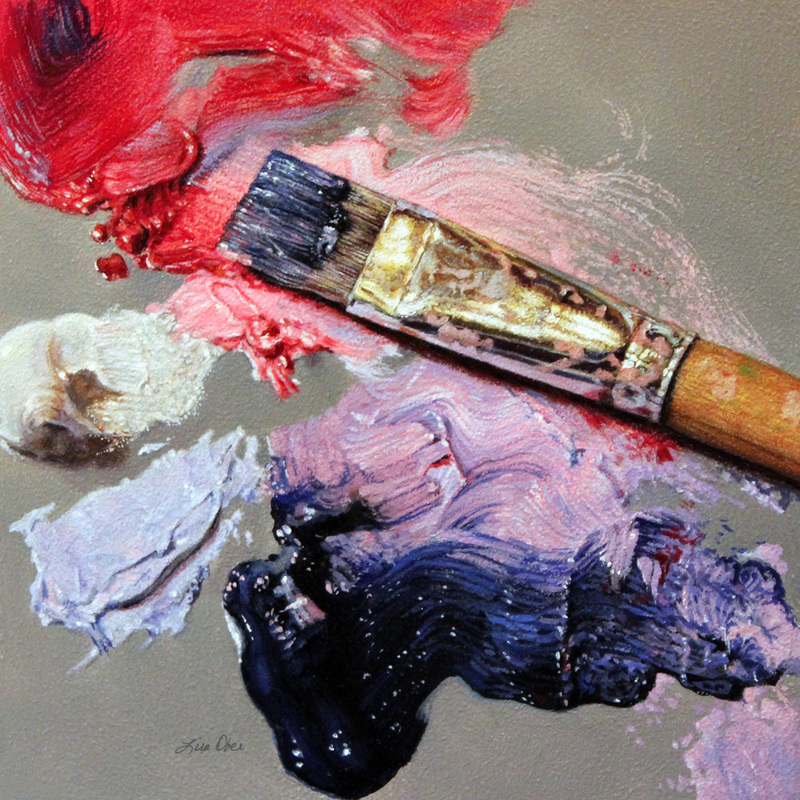
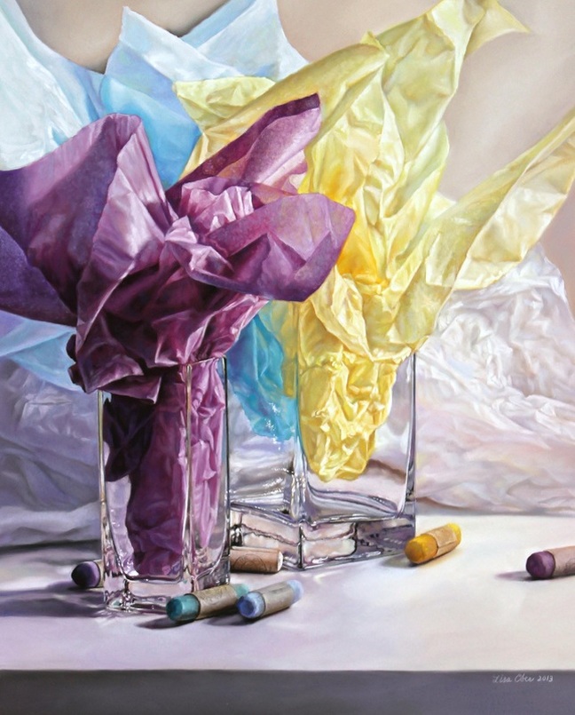
I work with so many beautiful colors each time I am in the studio and sometimes the tools themselves whisper to be the supporting actors in the painting drama. I couldn't resist the idea of placing my pastel sticks in this painting featuring pastel tissue paper-colored tissue paper…and it made for a title with a catchy play on words. |
Categories
All
Lisa OberWelcome! I'm so glad you are here and I hope you find some of the information I have shared helpful. 
Interested in taking a workshop? Click here for a listing of where I am heading and join me for the fun!
|